
VotersPulse began as an infographic and a visualization. Months later, a requirement for a QR code helped turn it into a website. The work between those two points is the part I find most instructive.
Through my work with members of the Ismaili community, we were exploring how to make civic information more useful and accessible. Encouraging participation raised questions beyond a reminder to vote. What does an office do? Who is on the ballot? Where can someone understand a candidate's position or a ballot measure? How do they find the voting information that applies to them?
There are many resources already doing important work in this space. The need we encountered was helping people navigate the questions and find a useful next step. That became the purpose behind VotersPulse, a nonpartisan starting point for voting information and official election resources.
The work before the website
We researched and learned. We built spreadsheets and analyzed information. We created graphics, invitations, and other collateral. Each format helped us examine a different part of the need.
An infographic can make a complicated subject easier to approach. A spreadsheet can help organize and compare information that does not yet fit into a clear explanation. An invitation can bring people into a conversation where the gaps become easier to see. None of those artifacts was the complete answer, but each helped us understand what the next version should carry.
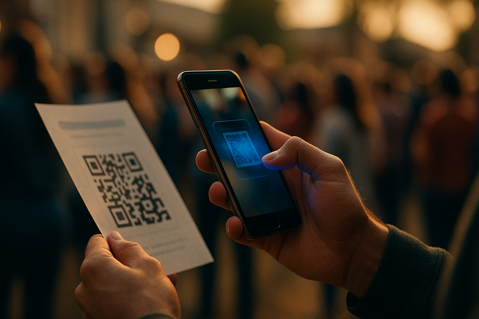
Then we needed a QR code. Technically, that is a small deliverable. The design question underneath it was larger: where should someone arrive after scanning it, and what should they be able to do there?
The design question underneath it was larger: where should someone arrive after scanning it, and what should they be able to do there?
The earlier material could introduce the subject. The destination needed to help people continue. That question moved the work toward a website and forced us to think beyond the page someone would see first.
Discovering and diagnosing the need
This is how I think about Discover and Diagnose in Strategy67's 4D method. The initial request gives us a place to begin. Working through it reveals the people, decisions, information, and handoffs that determine whether the result will be useful.
In this project, the need was broader than making another attractive communication. People needed a way to connect civic questions with information relevant to their location. The material had to help them understand where to go next, without presenting our project as a substitute for the election authorities responsible for the official information.
The distinction changed what we needed to design. A graphic can remain a graphic if it answers the need. A website becomes useful when the work requires an accessible destination that can connect people to more information and be updated as the project develops. The format follows what we have learned about the task.
A graphic can remain a graphic if it answers the need. A website becomes useful when the work requires an accessible destination that can connect people to more information and be updated as the project develops.
Designing a scope we can support
As we worked through the details, the effort required to go truly national became clearer. County coverage carries research, verification, organization, and maintenance work. Adding another location also adds information the project must be prepared to keep useful.
We chose to launch with a limited number of counties. That boundary is part of the design. It gives us a manageable place to begin and a way to learn what people need before making a broader promise.
It also keeps the operating questions visible. Which resources belong in the experience? How should official sources be distinguished from explanation? What happens when information changes or a link no longer works? What should a visitor understand about the project's coverage and limits?
Those questions continue after the first version is built. The website has an ongoing responsibility that the original request for a QR code did not make obvious.
Deploying with more to learn
VotersPulse is now launching at voterspulse.org. The aim is to make voting information easier to find and help people take a more informed part in civic life. The site is a starting point; visitors should confirm time-sensitive election details with the relevant official election authority.
In 4D, deployment carries the design into use and returns evidence to the next round of discovery. For this project, the next learning will come from how people navigate the resource, which questions remain difficult, and what the team can maintain reliably. Launch is the beginning of that work, not proof that the civic engagement gap has been solved.
Launch is the beginning of that work, not proof that the civic engagement gap has been solved.
Emerging technologies helped us research, organize, explore, and build. The value of that capability comes from the purpose it serves and the care around its use. We still had to ask better questions, make scope decisions, and take responsibility for what we put in front of people.
The people behind the work
I am deeply grateful to Fahim Hemani, Sam Chagani, and the many others who brought their knowledge, questions, and effort to this initiative. Their contributions helped illuminate a need and turn an early idea into something we can share.
I do not think of the infographic, spreadsheets, graphics, and collateral as detours on the way to the website. They were part of discovering the requirement. Had we skipped them, we might have built a site more quickly while understanding less about what it needed to do.
That is the example I hope this project offers: using the capabilities available to us, learning through the work, and building something in service of our communities. Explore the participating counties at voterspulse.org.